 Українська
 Russian
Личный кабинет
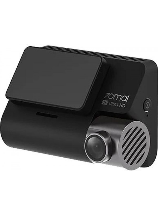
Відеореєстратор 70mai A800S
Код товара: 1878-01


- 6599 грн.
- Наличие: Есть в наличии
Быстрая доставка
г. Подольск
— Самовывоз из магазина, Привокзальная пл 2В
— Курьером по городу
В любой уголок Украины
— На отделение Новой Почты
— Адресная доставка от Новой Почты
14 дней на обмен\возврат
При сохранении товарного вида в соответсивии с действующим законодательсвом.
Оплата
— Наложенный платеж
— Наличными курьеру
— Безналичный расчет
— Предоплата
Описание
Описание и характеристики
.tab .content.description-content { padding-right: 0px !important; } .tab .content { padding: 0px !important; } .l-container { max-width: 1440px; background-color: #fff; position: relative; overflow: hidden; } .l-section { width: 100%; display: -webkit-box; display: -ms-flexbox; display: flex; background-color: #fff; position: relative; } @media screen and (max-width: 768px) { .l-section { max-height: none; height: auto; } } .l-color-background-1 { background-color: #96D8F1; } .l-color-background-2 { background-color: #DCE2F1; } .l-color-background-3 { background-color: #f4f5f7; } .l-color-background-4 { background-color: #fff; } .l-color-background-5 { background-color: #f4f5f7; } .l-color-background-6 { background-color: #fff; } .l-color-background-seven { background-color: #fff; } .l-color-background-eight { background-color: #e8e7ec; } .l-color-background-nine { background-color: #000; } .l-color-background-ten { background-color: #fff; } .l-half { width: 50%; position: relative; } @media screen and (max-width: 768px) { .l-half { width: 100%; height: 50%; } } .logo-title-wrapper { display: -webkit-box; display: -ms-flexbox; display: flex; -webkit-box-align: center; -ms-flex-align: center; align-items: center; padding-top: 3%; /*padding-left: 8.35%;*/ } @media screen and (max-width: 768px) { .logo-title-wrapper { -webkit-box-pack: center; -ms-flex-pack: center; justify-content: center; padding-left: 0; } } @media screen and (max-width: 480px) { .logo-title-wrapper { -webkit-box-orient: vertical; -webkit-box-direction: normal; -ms-flex-direction: column; flex-direction: column; } } /* .l-logo { width: ; height: ; } */ .l-main-title { font-size: 30px!important; font-weight: bold; padding: 0; margin: 0; -webkit-box-flex: 1; -ms-flex: 1; flex: 1; } @media screen and (max-width: 768px) { .l-main-title { text-align: center; padding-bottom: 2.61%; padding-top: 2.61%; -webkit-box-flex: 1; -ms-flex: 1; flex: 1; } } @media screen and (max-width: 480px) { .l-main-title { -webkit-box-flex: 0; -ms-flex: 0; flex: 0; font-size: 28px!important; } } .l-main-title-color { color: #000; } .l-description { -webkit-box-sizing: border-box; box-sizing: border-box; display: -webkit-box; display: -ms-flexbox; display: flex; -webkit-box-align: center; -ms-flex-align: center; align-items: center; -webkit-box-pack: center; -ms-flex-pack: center; justify-content: center; -webkit-box-orient: vertical; -webkit-box-direction: normal; -ms-flex-direction: column; flex-direction: column; padding: 0 8.35%; height: 100%; } @media screen and (max-width: 768px) { .l-description { text-align: center; } } .l-description-colorw { color: #fff; } .l-description-colorb { color: #000; } .l-title-colorw { color: #fff; } .l-title-colorb { color: #000; } .l-paragraph-colorb { color: #000; } .l-paragraph-colorw { color: #fff; } /* .l-description-intro { height: 80%; }*/ .pb { padding-bottom: 40px; } .pt { padding-top: 40px; } @media screen and (max-width: 768px) { .pt { padding-top: 0px; } } .l-title { font-size: 28px; padding: 0; margin: 0; margin-bottom: 4.01%; font-weight: normal; line-height: 38px; width: 100%; text-align: left; } @media screen and (max-width: 768px) { .l-title { margin-top: 30px; text-align: center; } } @media screen and (max-width: 480px) { .l-title { font-size: 24px; } } .l-title-color { color: #000; } .l-title-color2 { color: #fff; } .l-paragraph { font-size: 16px; line-height: 22px; padding: 0; margin: 0; } @media screen and (max-width: 768px) { .l-paragraph { margin-bottom: 30px; } } @media screen and (max-width: 480px) { .l-paragraph { font-size: 14px; } } .l-paragraph-color { color: #000; } .l-paragraph-color2 { color: #fff; } .l-img { max-width: 100%; -o-object-fit: cover; object-fit: cover; } .l-img-witdh { width: 50%; } @media screen and (max-width: 768px) { .l-img-witdh { width: 100%; } } .l-img-wrapper { display: -webkit-box; display: -ms-flexbox; display: flex; -ms-flex-wrap: wrap; flex-wrap: wrap; } .l-center { display: -webkit-box; display: -ms-flexbox; display: flex; -webkit-box-align: center; -ms-flex-align: center; align-items: center; -webkit-box-pack: center; -ms-flex-pack: center; justify-content: center; } @media screen and (max-width: 768px) { .l-center img { height: auto; } } .l-title-center { text-align: center; margin-top: 30px; margin-bottom: 2.01%; } .l-paragraph-center { text-align: center; padding: 0 8.35%; margin-bottom: 30px; } .l-flex { display: -webkit-box; display: -ms-flexbox; display: flex; -webkit-box-orient: vertical; -webkit-box-direction: normal; -ms-flex-direction: column; flex-direction: column; } .l-relative { position: relative; } @media screen and (max-width: 768px) { .l-section-reverse { -webkit-box-orient: vertical; -webkit-box-direction: reverse; -ms-flex-direction: column-reverse; flex-direction: column-reverse; } } @media screen and (max-width: 768px) { .l-column { display: -webkit-box; display: -ms-flexbox; display: flex; -webkit-box-orient: vertical; -webkit-box-direction: normal; -ms-flex-direction: column; flex-direction: column; } } .m1 { max-width: 150%; } .m2 { max-width: 87%; } .m3 { max-width: 87%; } .m4 { max-width: 87%; } .m5 { max-width: 97%; } .m6 { max-width: 98%; } .m7 { max-width: 146%; } .m8 { max-width: 128%; } .m9 { max-width: 155%; } .m10 { max-width: 75%; }Якість 4K UHD
Відеореєстратор 70mai A800S став тим набором, який здатний забезпечувати вашу безпеку на дорозі і під час паркування. Техніка підтримує роздільну здатність 4K UHD (3840x2160), що стало запорукою ідеальної чіткої картинки у найдрібніших деталях. Свідком чого ви б не стали, всі деталі будуть зафіксовані і чітко видимі. Чіткість кадру гарна навіть в процесі руху.
.