.tab .content.description-content { padding-right: 0px !important; } .tab .content { padding: 0px !important; } .l-container { max-width: 1198px; background-color: white; position: relative; overflow: hidden; } .l-container--sm{ max-width: 1000px; } .l-section { width: 100%; display: -webkit-box; display: -ms-flexbox; display: flex; background-color: #fff; position: relative; } .br-2{ border-radius: 14px; } .l-section--no-title{ padding-top: 25px; } @media screen and (max-width: 768px) { .l-section { max-height: none; height: auto; } .l-container { border: none; border-radius: 0px; } } .l-color-background-1 { background: #f1f1f1; } .l-color-background-2 { background-color: #ffffff; } .l-color-background-3 { background-color: #F7F7F7; } .l-color-background-4 { background-color: #eaeaea; } .l-color-background-5 { background: #000000; } .cut-img2.no-margin-top, .cut-img.no-margin-top{ margin-top: 0px; } .bottom-offset{ margin-bottom: 4%; } .logo-title-wrapper h2 { padding-left: 0 !important; font-size: 28px; } .l-half { width: 50%; position: relative; } @media screen and (max-width: 768px) { .l-half { width: 100%; height: 50%; } } .logo-title-wrapper { display: -webkit-box; display: -ms-flexbox; display: flex; -webkit-box-align: flex-start; -ms-flex-align: flex-start; align-items: flex-start; padding-bottom: 30px; } .logo-title-wrapper2 { display: -webkit-box; display: -ms-flexbox; display: flex; -webkit-box-align: center; -ms-flex-align: center; align-items: center; padding-top: 3%; text-align: center; } .logo-title-wrapper3 { display: -webkit-box; display: -ms-flexbox; display: flex; -webkit-box-align: center; -ms-flex-align: center; align-items: center; padding-bottom: 5%; font-size: 17px; align-self: flex-start; } @media screen and (max-width: 768px) { .logo-title-wrapper, .logo-title-wrapper2 { -webkit-box-pack: center; -ms-flex-pack: center; justify-content: center; padding-left: 0; align-items: center; padding-top: 3%; } .logo-title-wrapper3 { align-self: center; } } .l-logo { padding-right: 15px; align-self: flex-start; } @media screen and (max-width: 480px) { .logo-title-wrapper, .logo-title-wrapper2, .logo-title-wrapper3 { -webkit-box-orient: vertical; -webkit-box-direction: normal; -ms-flex-direction: column; flex-direction: column; } .l-logo { padding-right: 15px; padding-bottom: 7px; align-self: center; } } .l-main-title { font-size: 29px !important; font-weight: bold; padding: 0; margin: 0; -webkit-box-flex: 1; -ms-flex: 1; flex: 1; } @media screen and (max-width: 768px) { .l-main-title { text-align: center; padding-bottom: 2.61%; padding-top: 2.61%; -webkit-box-flex: 1; -ms-flex: 1; flex: 1; } .l-img-padding2 { padding-bottom: 9px; padding-top: 20px; } } @media screen and (min-width: 481px) and (max-width: 768px) { .l-logo { padding-right: 15px; } } @media screen and (max-width: 480px) { .l-main-title { -webkit-box-flex: 0; -ms-flex: 0; flex: 0; font-size: 28px !important; } .l-logo { padding-right: 0px; } .l-main-title-color { text-align: center; } } .l-main-title-color { color: #ffffff; font-size: 30px; /*inj*/ } .l-description { -webkit-box-sizing: border-box; box-sizing: border-box; display: -webkit-box; display: -ms-flexbox; display: flex; -webkit-box-align: center; -ms-flex-align: center; align-items: center; -webkit-box-pack: center; -ms-flex-pack: center; justify-content: center; -webkit-box-orient: vertical; -webkit-box-direction: normal; -ms-flex-direction: column; flex-direction: column; padding: 0 8.35%; height: 100%; padding-top: 25px; padding-bottom: 25px; } .l-description2 { -webkit-box-sizing: border-box; box-sizing: border-box; display: -webkit-box; display: -ms-flexbox; display: flex; -webkit-box-align: center; -ms-flex-align: center; align-items: center; -webkit-box-pack: center; -ms-flex-pack: center; justify-content: flex-start; -webkit-box-orient: vertical; -webkit-box-direction: normal; -ms-flex-direction: column; flex-direction: column; padding: 0 8.35%; height: 100%; } @media screen and (max-width: 768px) { .l-description, .l-description2 { text-align: center; } .l-description--mobile-left{ text-align: left; } } .l-description-colorw { color: #fff; } .l-description-colorb { color: #000; } .l-title-colorw { color: #ffffff; } .l-title-colorb { color: #000000; } .l-title-colorc { color: #8BC605; } .l-paragraph--accent span{ color: #8BC605; } .l-title-bold{ font-weight: bold !important; } @media (max-width: 900px) { .l-title-colorbll { color: #000000; } } .l-paragraph-colorbll { color: #ffffff; } @media (max-width: 900px) { .l-paragraph-colorbll { color: #000000; } } .l-paragraph-colorb { color: #000; } .l-paragraph-colorw { color: white; } .pb { padding-bottom: 40px; } .pb2 { padding-bottom: 50px; } .pb3 { padding-bottom: 25px; } .pt { padding-top: 40px; } .pti { padding-top: 40px; } .pbi { padding-bottom: 0px; } .pt2 { padding-top: 50px; } .pt3 { padding-top: 25px; } @media screen and (max-width: 768px) { .pt, .pt2 { padding-top: 0; } .pb { padding-bottom: 0; } .pbi { padding-bottom: 25px; } } @media screen and (max-width: 768px) { .pb3 { padding-bottom: 30px; } } .l-title { font-size: 28px; padding: 0; text-align: left; margin: 0; margin-bottom: 20px; box-sizing: border-box; font-weight: normal; line-height: 38px; width: 100%; } .l-title--center { text-align: center; } .l-title-h4 { font-size: 24px; padding: 0; margin: 0; margin-bottom: 4.01%; font-weight: normal; line-height: 30px; width: 100%; text-align: left; } .icon-container .l-title{ margin-bottom: 17px; } @media screen and (max-width: 768px) { .l-title { margin-top: 30px; text-align: center; } .icon-container .l-title{ margin-top: 0px; } .l-title-h4 { margin-top: 30px; text-align: center; } } @media screen and (max-width: 480px) { .l-title { font-size: 24px; line-height: 30px; } .l-title-h4 { font-size: 24px; } } .l-title-color { color: #000; } .l-title-color2 { color: #fff; } .l-paragraph { font-size: 16px; line-height: 22px; padding: 0; width: 100%; box-sizing: border-box; margin: 0; } @media screen and (max-width: 768px) { .l-paragraph { margin-bottom: 30px; } .icon-container .l-paragraph{ margin-bottom: 0px; } .l-paragraph--mb-left{ text-align: left; } } @media screen and (max-width: 480px) { .l-paragraph { font-size: 16px; } } .l-paragraph-color { color: #000; } .l-paragraph-color2 { color: #fff; } .l-img { max-width: 100%; -o-object-fit: cover; object-fit: cover; transition: all 1s ease; } .l-img-witdh { width: 30%; margin-right: 1%; border-radius: 4%; } .l-img-witdh2 { width: 23%; margin-right: 2%; } .l-img-witdh3 { width: 45%; margin-right: 4%; border-radius: 15px; } .l-img-witdh4 { width: 100%; } .l-img-witdh5 { width: 46%; padding-right: 0; border-radius: 24px; } .l-img-witdh:last-child { margin-right: 0%; } .l-img-witdh2:last-child { margin-right: 0%; } .l-img-witdh3:last-child { margin-right: 0%; } .l-img-witdh5:last-child { margin-left: 8%; } @media screen and (max-width: 800px) { .l-img1 { width: 132%; } } @media screen and (max-width: 768px) { .l-img-witdh2 { width: 38%; margin-right: 0px; } .l-img-witdh2:nth-child(n+1){ margin-right: 2%; } .l-img-witdh2:nth-child(n+3){ margin-top: 2%; } .l-img-witdh3 { width: 90%; margin-bottom: 45px; margin-right: 0; } } @media screen and (max-width: 576px) { .l-img-witdh2 { width: 45%; margin-right: 0px; } } .l-img-wrapper { display: -webkit-box; display: -ms-flexbox; display: flex; -ms-flex-wrap: wrap; flex-wrap: wrap; justify-content: center; } .l-img-wrapper--padding-bottom{ padding-bottom: 2.2%; } .l-img-wrapper2 { display: -webkit-box; display: -ms-flexbox; display: flex; -ms-flex-wrap: wrap; flex-wrap: wrap; justify-content: center; margin-top: 10%; } @media screen and (max-width: 768px) { .l-img-wrapper2 { flex-direction: column; align-items: center; } .l-img-wrapper2 img { width: 95%; margin-bottom: 5%; } .l-img-wrapper--padding-bottom{ padding-bottom: 0%; } .l-img-witdh5:last-child { margin-left: 0; } } .l-center { display: -webkit-box; display: -ms-flexbox; display: flex; -webkit-box-align: center; -ms-flex-align: center; align-items: center; -webkit-box-pack: center; -ms-flex-pack: center; justify-content: center; } .l-center--end { -webkit-box-align: end;-ms-flex-align: end;align-items: flex-end; } .l-center-bosch { justify-content: flex-end !important; } @media screen and (max-width: 768px) { .l-center img { height: auto; } .l-paragraph-center, .l-paragraph-center1, .l-description, .l-description2 { padding: 0 5% !important; } } .l-title-center { text-align: center; box-sizing: border-box; margin-top: 30px; margin-bottom: 20px; padding: 0 8.35%; } .l-paragraph-center { text-align: center; padding: 0 8.35%; box-sizing: border-box; margin-bottom: 30px; } .l-paragraph-center--bottom{ margin-top: 30px; } .l-paragraph-center--left{ text-align: left; } .l-paragraph-center1 { text-align: center; padding: 0%; margin-bottom: 30px; } .l-paragraph-left { text-align: left; padding: 0 8.35%; margin-bottom: 8px; } .l-flex { display: -webkit-box; display: -ms-flexbox; display: flex; -webkit-box-orient: vertical; -webkit-box-direction: normal; -ms-flex-direction: column; flex-direction: column; } .l-relative { position: relative; } @media screen and (max-width: 768px) { .l-section-reverse { -webkit-box-orient: vertical; -webkit-box-direction: reverse; -ms-flex-direction: column-reverse; flex-direction: column-reverse; } } @media screen and (max-width: 768px) { .l-column { display: -webkit-box; display: -ms-flexbox; display: flex; -webkit-box-orient: vertical; -webkit-box-direction: normal; -ms-flex-direction: column; flex-direction: column; } .product-cms__big-description { padding: 0 !important; } } .section-list{ margin: 0px; padding: 0px; list-style-type: disc; } .section-list--center-bottom{ margin-bottom: 30px; /* padding: 0 8.35%; */ padding: 0 4%; width: 100%; box-sizing: border-box; } .section-list--offset-top{ margin-top: 20px; } .section-list--side{ width: 100%; text-align: left; } .section-list-colorw{ color: white; } .section-list__item{ line-height: 1.4em; margin-left: 5%; font-size: 16px; } .section-list__item + .section-list__item{ margin-top: 5px; } .l-paragraph--section-list{ margin-bottom: 17px; } @media (min-width: 800px) and (max-width: 940px) { .l-paragraph { font-size: 14px; line-height: 20px; } .l-title { font-size: 23px !important; margin-bottom: 20px; line-height: 26px; } .l-main-title { font-size: 23px !important; line-height: 26px !important; padding-bottom: 5px !important; } .section-list__item{ font-size: 14px; } } @media (min-width: 769px) and (max-width: 799px) { .l-paragraph { font-size: 12px; line-height: 19px; } .section-list__item{ font-size: 12px; } .l-title { font-size: 21px !important; margin-bottom: 20px; line-height: 26px; } .l-main-title { font-size: 23px !important; line-height: 26px !important; padding-bottom: 5px !important; } } .l-img-padding2 { padding-bottom: 30px; padding-top: 30px; } /*класс для скругления изображений*/ .cut-img { max-width: 90%; margin: 5% 5%; /* border-radius: 24px; */ } .cut-img12 { max-width: 90%; margin: 5% 5%; margin-bottom: 0%; /* border-radius: 24px; */ } .cut-img2 { max-width: 90%; margin: 5% 5%; border-radius: 24px; } .cut-img3 { max-width: 96%; margin: 0% 2%; margin-bottom: 2%; border-radius: 12px; } .cut-img4 { max-width: 96%; margin: 0% 2%; margin-bottom: 2%; } .cut-img4--first{ margin-top: 2%; } .cut-img5 { max-width: 95.7%; border-radius: clamp(10px, 3vw, 34px); } .cut-img6 { max-width: 40%; margin: 10% 10%; } .cut-img7 { max-width: 95%; margin: 0% 10% 2% 10%; border-radius: 20px; } @media screen and (max-width: 768px) { .icon-group { width: 90%; margin: 30px auto; } .cut-img12 { margin-top: 0px; } .section-list--offset-top{ margin-top: 0px; margin-bottom: 30px; } } .video-container { overflow: hidden; position: relative; width: 96%; border-radius: clamp(10px, 3vw, 34px); } .video-container::after { padding-top: 56.25%; display: block; content: ""; } .video-container iframe { position: absolute; top: 0; left: 0; width: 100%; height: 100%; } .video-container-side { overflow: hidden; position: relative; width: 87%; border-radius: 0px; } .video-container-side::after { padding-top: 56.25%; display: block; content: ""; } .video-container-side iframe { position: absolute; top: 0; left: 0; width: 100%; height: 100%; } .sub-description-img { display: flex; justify-content: space-around; flex-wrap: nowrap; } .sub-description-img .cut-img{ margin-bottom: 0px; border-radius: 25px; } .sub-container { width: 45%; display: flex; flex-direction: column; align-items: center; justify-content: space-between; } @media screen and (max-width: 768px) { .sub-description-img { flex-direction: column; align-items: center; } } .hexa-block { display: flex; flex-wrap: wrap; justify-content: space-between; width: 100%; padding: 0 3%; } .hexa-img { width: 33%; padding: 1%; border-radius: 24px; } @media screen and (max-width: 768px) { .hexa-img { width: 50%; border-radius: 16px; } } .l-section2 { min-height: 700px; display: flex; padding: 20px; } .rhalf__img { max-width: 40%; border-radius: 24px; } .lhalf__img { max-width: 90%; border-radius: 24px; } .side__left { flex: 0 0 400px; } .side__right { flex: 1 1 auto; display: flex; flex-direction: column; } .half__right { display: flex; box-sizing: border-box; flex: 1; justify-content: center; align-items: center; padding: 0 10px; margin: 20px; } .half__left { height: 100%; display: flex; flex-direction: column; justify-content: flex-start; align-items: center; margin: 20px; } .inside__right { display: flex; flex-direction: column; } @media screen and (max-width: 768px) { .l-section2 { display: flex; flex-direction: column; } .half__left { margin: 0; } .lhalf__img { max-width: 95%; border-radius: 8px; } .half__right { flex-direction: column; margin: 0; padding: 0; } .rhalf__img { max-width: 95%; border-radius: 8px; } .order_custom { order: 3; } } .smallitems-group { display: flex; justify-content: center; flex-wrap: wrap; } .m-icon { padding: 20px 0; } @media screen and (max-width: 768px) { .m-icon { width: 26%; } .smallitems-group { margin-bottom: 5%; } } @media screen and (max-width: 375px) { .m-icon { padding: 10px 0; width: 45%; } } .l-title-st { font-size: 28px; padding: 0; text-transform: uppercase; margin: 0; margin-bottom: 4.01%; font-weight: normal; line-height: 38px; width: 100%; } .l-paragraph-st { font-size: 16px; line-height: 22px; padding: 0; margin: 0; } .l-description-st { -webkit-box-sizing: border-box; box-sizing: border-box; display: -webkit-box; display: -ms-flexbox; display: flex; -webkit-box-orient: vertical; -webkit-box-direction: normal; -ms-flex-direction: column; flex-direction: column; -webkit-box-align: start; -ms-flex-align: start; align-items: flex-start; padding: 0 8.35%; height: 100%; } @media screen and (max-width: 1200px) { .l-title-st { font-size: 24px !important; line-height: 28px !important; } .l-paragraph-st { font-size: 14px !important; line-height: 20px !important; } } @media screen and (max-width: 900px) { .l-title-st { margin-top: 30px; text-align: center; } .l-paragraph-st { margin-bottom: 30px; } .l-description-st { text-align: center; -webkit-box-align: center;-ms-flex-align: center;align-items: center; padding: 0 3% !important; } .l-column-st { display: -webkit-box; display: -ms-flexbox; display: flex; -webkit-box-orient: vertical; -webkit-box-direction: normal; -ms-flex-direction: column; flex-direction: column; } } .left-description-absolute { position: absolute; width: 47%; top: 50%; left: 0%; z-index: 2; padding: 27px 0; -webkit-transform: translateY(-50%);-ms-transform: translateY(-50%);transform: translateY(-50%) } .left-description-absolute1 { position: absolute; width: 45%; top: 21%; left: 0%; z-index: 2; padding: 20px 0; } .left-description-absolute2 { position: absolute; width: 45%; top: 0%; left: 0%; z-index: 2; } .right-description-absolute { position: absolute; width: 47%; text-align: right; top: 50%; right: 0%; z-index: 2; padding: 30px 0; -webkit-transform: translateY(-50%);-ms-transform: translateY(-50%);transform: translateY(-50%) } .right-description-absolute1 { position: absolute; width: 43%; top: 30%; right: 0%; z-index: 2; padding: 30px 0; } .center-description-absolute { position: absolute; width: 100%; top: 0%; left: 0%; z-index: 2; } .center-description-absolute1 { position: absolute; width: 100%; top: 30%; z-index: 2; } .l-background-main-img-1 { width: 100%; height: 655px; background: url(1.jpg); background-size: cover; background-repeat: no-repeat; background-position: right center; } .l-color-background-absolute-1 { background: #367a98; } .l-color-background-absolute-3 { background: #1a1b1bbf; } .l-color-background-absolute-4 { backdrop-filter: blur(4px); border-radius: 0px 16px 16px 0px; background: transparent; } .l-color-background-absolute-5 { background: transparent; } /*media breakpoint*/ @media screen and (max-width: 900px) { .left-description-absolute, .left-description-absolute1, .right-description-absolute, .right-description-absolute1, .right-description-absolute-2, .center-description-absolute, .center-description-absolute1 { position: relative; width: 100%; padding: 0; left: 0; right: 0; -webkit-transform: none;-ms-transform: none;transform: none } .l-color-background-absolute-1 { background: #e5e7e1e9; border-radius: 0; } .l-color-background-absolute-2 { background: #101624; border-radius: 0; } .l-color-background-absolute-3 { background: black; border-radius: 0; } .l-color-background-absolute-4 { background: #f7f7f7; border-radius: 0; } .l-color-background-absolute-5 { background: #d8d1c5; } .l-background-main-img-1 { height: 90vw; background-size: cover; background-position: right; } .l-background-main-img-2 { height: 90vw; background-size: cover; background-position: left; } .l-background-main-img-3 { height: 70vw; background-size: cover; background-position: left; } .l-background-main-img-4 { height: 70vw; background-size: cover; background-position: bottom; } .l-background-main-img-5 { height: 60vw; background-size: cover; background-position: right; } .l-background-main-img-6 { height: 70vw; background-size: cover; } .l-background-main-img-7 { height: 70vw; background-size: cover; } } @media screen and (max-width: 768px) { .l-background-main-img-1 { background-size: cover; } .l-background-main-img-2 { background-size: cover; } .l-background-main-img-3 { background-size: cover; } .l-background-main-img-4 { height: 50vw; background-size: cover; } .l-background-main-img-5 { height: 72vw; background-size: cover; } .l-background-main-img-6 { height: 54vw; background-size: cover; } .l-background-main-img-7 { height: 85vw; background-size: cover; } } .in-the-shadows-uu { text-shadow: 3px 3px 6px #000000; } .smsng-img-wrap { position: relative; } .smsng-fade-img { position: absolute; top: 0; left: 0; animation: likeadragon 6s infinite; } .six-reasons-dec { display: block; } .six-reasons-mob { display: none; } @media screen and (max-width: 768px) { .six-reasons-dec { display: none; } .six-reasons-mob { display: block; } } @media screen and (max-width: 900px) { .v8-colorize { color: #000; } .l-color-background-absolute-1, .l-color-background-absolute-2, .l-color-background-absolute-3, .l-color-background-absolute-4, .l-color-background-absolute-5 { padding-bottom: 30px; } } @media screen and (max-width: 768px) { .l-color-background-absolute-1, .l-color-background-absolute-2, .l-color-background-absolute-3, .l-color-background-absolute-4, .l-color-background-absolute-5 { padding-bottom: 0; } } .rock-link { align-self: flex-start; margin-top: 24px; } @media screen and (max-width: 768px) { .rock-link { align-self: center; margin-top: 16px; } } .bg-blur { backdrop-filter: blur(5px); } .sub-description-img { display: flex; justify-content: space-around; align-items: flex-start; } .sub-container { width: 49%; display: flex; flex-direction: column; align-items: center; } .pb3 { padding-bottom: 40px; } @media screen and (max-width: 768px) { .pb3 { padding-bottom: 30px; } } .irrig-start { align-self: flex-start; } @media screen and (max-width: 900px) { .irrig-start { align-self: center; } } .icon-phil { width: 100px; height: auto; object-fit: cover; margin-right: 32px; } .icon-phil2 { width: 170px; height: 170px; object-fit: cover; margin-right: 32px; } .icon-container { width: 100%; padding: 15px 8.5%; box-sizing: border-box; display: flex; align-items: center; } .icon-container:last-child{ margin-bottom: 30px; } .icon-description-block { width: 100%; } .icon-description-block h3, .icon-description-block p { text-align: left; } .icon-description-block h3 { margin-bottom: 0; } @media screen and (max-width: 500px) { .icon-phil { margin-right: 0px; } .icon-container { flex-direction: column; padding: 0; margin-bottom: 17px; } .icon-description-block h3, .icon-description-block p { text-align: center; } .icon-container .l-title{ margin-top: 10px; } .icon-description-block h3 { margin-bottom: 24px; } } .half_width-custom { width: 90%; } @media screen and (max-width: 768px) { .half_width-custom { width: 100%; } } .video_bg { position: relative; width: 100%; object-fit: cover; } .video-color-bg { position: relative; line-height: 0px; background: #000; } .video-color-bg::after { content: ""; position: absolute; top: 0; left: 0; width: 100%; height: 100%; background: #00000000; z-index: 1; } @media (max-width: 900px) { .video-color-bg::after { background: transparent; } .video_bg { position: relative; object-fit: cover; } } .bg-img-section{ position: relative; } .bg-img-section__main *{ box-sizing: border-box; } .bg-img-section__main{ position: absolute; } .bg-img-section--1 .bg-img-section__main{ width: 45%; left: 5%; top: 50%; -webkit-transform: translateY(-50%);-ms-transform: translateY(-50%);transform: translateY(-50%); } .bg-img-section--2 .bg-img-section__main{ width: 50%; left: 5%; top: 8%; } .bg-img-section--8 .bg-img-section__main{ width: 35%; left: 4%; top: 50%; -webkit-transform: translateY(-50%);-ms-transform: translateY(-50%);transform: translateY(-50%); } .bg-img-section--right-bottom .bg-img-section__main{ width: 30%; right: 10%; bottom: 20%; } .bg-img-section--center .bg-img-section__main{ width: 45%; left: 50%; top: 100%; text-align: center; -webkit-transform: translateX(-50%);-ms-transform: translateX(-50%);transform: translateX(-50%); } .bg-img-section--center .l-title{ text-align: center; } .bg-img-section--3 .bg-img-section__main{ width: 45%; left: 5%; top: 12%; } .blocks-wrap{ max-width: 1000px; margin: 0 auto; } .bg-img-section--4 .bg-img-section__main{ width: 40%; left: 10%; top: 50%; -webkit-transform: translateY(-50%);-ms-transform: translateY(-50%);transform: translateY(-50%); } .first-block{ padding-bottom: 50px; } @media (max-width: 768px) { .first-block{ padding-bottom: 25px; } } .bg-img-section--5 .bg-img-section__main{ width: 60%; left: 50%; top: 5%; -webkit-transform: translateX(-50%);-ms-transform: translateX(-50%);transform: translateX(-50%); text-align: center !important; } .bg-img-section--left .bg-img-section__main{ width: 48%; left: 10%; top: 50%; -webkit-transform: translateY(-50%);-ms-transform: translateY(-50%);transform: translateY(-50%); } .bg-img-section--text-bg .bg-img-section__main{ background: rgba(0, 0, 0, .50); border-radius: 10px; padding: 20px 25px; } .bg-img-section--left-top .bg-img-section__main{ width: 40%; left: 5%; top: 10%; } .bg-img-section--right .bg-img-section__main{ width: 50%; right: 5%; top: 50%; -webkit-transform: translateY(-50%);-ms-transform: translateY(-50%);transform: translateY(-50%); } .bg-img-section--right2 .bg-img-section__main{ width: 54%; left: 42%; top: 8%; } .bg-img-section--center .bg-img-section__main{ width: 78%; left: 50%; text-align: center !important; top: 7%; -webkit-transform: translateX(-50%); -ms-transform: translateX(-50%); transform: translateX(-50%); } .bg-img-section--block .bg-img-section__main{ background-color: rgba(0,0,0,.75); border-radius: 20px; padding: 20px 40px; box-sizing: border-box; } @media (max-width: 992px) { .sub-description-img .cut-img{ order: 3; margin-top: 0px; margin-bottom: 5%; } .bg-img-section--block .bg-img-section__main{ padding: 0 3%; background-color: transparent; border-radius: 0px; } .bg-img-section__main{ position: static; width: auto !important; padding: 0 3%; text-align: center !important; -webkit-transform: none !important;-ms-transform: none !important;transform: none !important; } .bg-img-section--text-bg .bg-img-section__main{ background: none; border-radius: 0px; padding: 0 3%; } .bg-img-section .l-title{ text-align: center !important; } .bg-img-section__main.mobile-black .l-title-colorw, .bg-img-section__main.mobile-black .l-paragraph-colorw{ color: black !important; } .bg-img-section__main.mobile-white .l-title-colorb, .bg-img-section__main.mobile-white .l-paragraph-colorb{ color: white !important; } .l-title--bg-img{ padding-top: 30px; margin-top: 0px !important; } .bg-img-section__img{ margin-top: 26px; } } .l-img--mobile{ display: none; } .l-section--start .l-paragraph{ margin-bottom: 20px; margin-top: 20px; } @media (max-width: 992px) { .l-img--mobile{ display: block; } .l-img--full{ display: none; } } @media (max-width: 768px) { .bg-img-section__img{ margin-top: 0px; } } .block-nums{ display: -ms-grid; display: grid; -ms-grid-columns: (1fr)[3]; grid-template-columns: repeat(3, 1fr); text-align: center; color: white; padding-bottom: 40px; } .block-nums__item-num{ color: #31BFE5; font-weight: bold; line-height: 1em; font-size: 40px; margin: 12px 0; } .block-nums__item-text{ font-size: 17px; line-height: 1.2em; } @media (max-width: 768px) { .block-nums{ display: block; } .block-nums__item + .block-nums__item{ margin-top: 67px; } } .lg-title{ font-size: 35px; margin: 0px; margin-bottom: 27px; padding-top: 32px; font-weight: 500; font-weight: bold; color: black; line-height: 1.2em; } .lg-title--w{ color: white; } .section-margin-top{ padding-top: 40px; } .details{ display: flex; width: 100%; padding: 25px 0 40px 0; justify-content: center; align-items: flex-start; } .details__item + .details__item{ margin-left: 8%; } .details__value{ font-size: 37px; color: #135ACA; line-height: 1.2em; font-weight: bold; } .details__value span{ font-size: 24px; } .details__name{ font-size: 17px; color: black; margin-bottom: 7px; line-height: 1.2em; } .sm-block .cut-img{ margin-bottom: 0px; } .sm-section{ max-width: 900px; margin: 0 auto; } .multi-blocks-section .l-title-h4{ margin-top: 0px; } .l-img-wrapper--sm{ width: 90%; padding-bottom: 4%; } .content-list{ margin: 0px; box-sizing: border-box; width: 100%; padding-left: 25px; } .l-center .content-list{ margin-bottom: 30px; width: 80%; } .content-list__item{ line-height: 1.2em; list-style-type: disc; font-size: 16px; } .content-list__item + .content-list__item{ margin-top: 8px; } .l-center--text-left .l-paragraph-center { text-align: left; } .l-center--text-left .l-title-center { text-align: left; } .battery-icon{ width: 42%; max-width: 210px; margin-bottom: 27px; align-self: flex-start; } .l-section--last{ margin-bottom: 20px; } .offset-top{ margin-top: 1.2%; } .cut-img25{ border-radius: 10px; overflow: hidden; } .l-paragraph--offset-top{ margin-top: 30px; } .l-paragraph--bottom-offset{ margin-bottom: 30px; } .block-icons{ max-width: 500px; width: 100%; height: auto; align-self: flex-start; margin-top: 27px; } @media (max-width: 992px) { .lg-title{ font-size: 28px; padding-top: 20px; } .details__value{ font-size: 28px; } .details__value span{ font-size: 20px; } .sub-container { width: 100%; } .sub-description-img { flex-direction: column; align-items: center; } .sub-container { width: 100%; } } .l-paragraph-offset-top{ margin-top: 25px; } @media (max-width: 768px) { .lg-title{ margin-bottom: 20px; } .cut-img2, .cut-img { margin-top: 0px; } .l-img-wrapper--sm{ width: 100%; padding-bottom: 0%; } .battery-icon{ display: none; } .l-paragraph--bottom-offset{ margin-bottom: 0px; } .l-center--text-left .l-title-center { padding: 0 3%; } .details{ display: block; text-align: center; } .details__item + .details__item{ margin-left: 0%; margin-top: 50px; } .l-center .content-list{ width: 92%; } .l-paragraph--mb-left{ text-align: left; } .section-list--center-bottom{ padding: 0 3%; } .icon-container{ padding: 15px 5%; } } @media (max-width: 576px) { .lg-title{ font-size: 24px; } .icon-phil { width: 75px; } } .l-img--shadow{ -webkit-box-shadow: 0px 0px 17px 0px rgba(34, 60, 80, 0.11); -moz-box-shadow: 0px 0px 17px 0px rgba(34, 60, 80, 0.11); box-shadow: 0px 0px 17px 0px rgba(34, 60, 80, 0.11); } .l-section--offset { padding-top: 50px; }
Roborock: новий погляд на чистоту
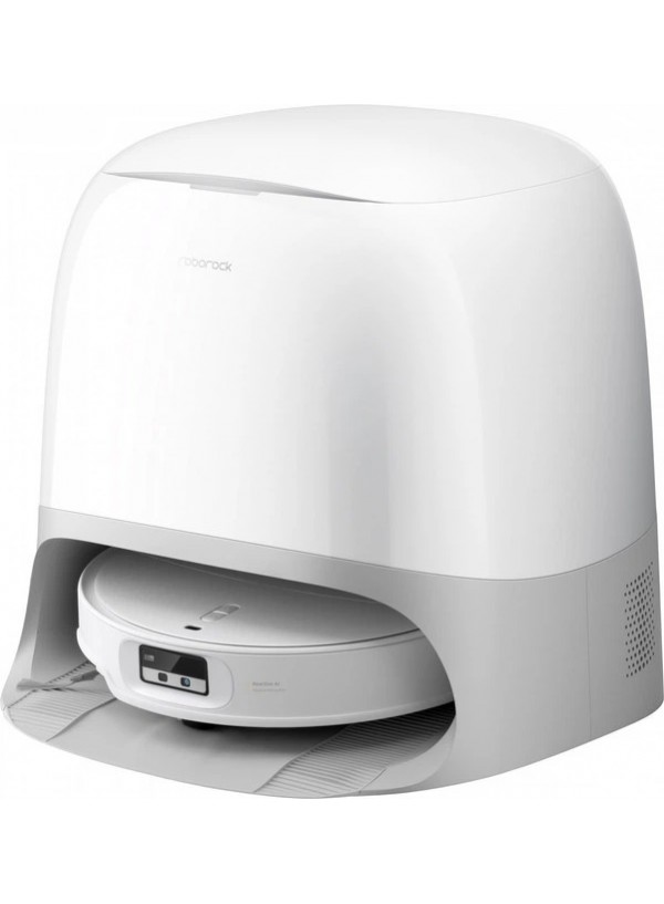
Потужний і функціональний робот-пилосос Roborock Qrevo Curv 2 Pro поєднує компактний дизайн і передові технології, підтримуючи ідеальну чистоту на будь-яких поверхнях. Висота корпусу всього 7.98 см дозволяє пристрою вільно проходити під меблями, а подвійна система протидії заплутуванню гарантує якісне прибирання в будинку з домашніми тваринами. Навігаційна система RetractSense забезпечує точне побудування маршрутів, а вдосконалене шасі AdaptiLift допомагає долати пороги й нерівності до 4 см. Розумне розпізнавання перешкод у поєднанні з технологією VertiBeam дозволяє роботу обходити перепони й працювати максимально продуктивно. Вбудований голосовий помічник робить керування зручним та інтуїтивним: ти можеш задавати команди й контролювати процес прибирання силою голосу.

 Russian