.tab .content.description-content { padding-right: 0px !important; } .tab .content { padding: 0px !important; } .l-container { max-width: 1198px; background-color: #fff; position: relative; overflow: hidden; } .l-section { width: 100%; display: -webkit-box; display: -ms-flexbox; display: flex; background-color: #fff; position: relative; } @media screen and (max-width: 768px) { .l-section { max-height: none; height: auto; } } .l-color-background-1 { background-color: #00142d; } .l-color-background-2 { background-color: #ced4e2; } .l-color-background-3 { background-color: #05152c; } .l-color-background-4 { background-color: #cdd5e2; } .l-color-background-5 { background-color: #3b4560; } .l-color-background-6 { background-color: #31343c; } .l-color-background-7 { background-color: #E4E4E4; } .l-color-background-8 { background-color: #EBEBEB; } .l-color-background-9 { background-color: #f2f2f2; } .l-color-background-10 { background-color: #F8E7FA; } .l-color-background-11 { background: linear-gradient(180deg, #F8E7FA 0%, #F8F8F8 100%); } .l-color-background-12 { background-color: #fff; } .l-color-background-13 { background-color: #fff; } .l-color-background-14 { background: linear-gradient(180deg, #FFFFFF 0%, #F8F8F8 100%); } } .logo-title-wrapper, .logo-title-wrapper2 h2 { padding-left: 0/*!important*/; } .l-half { width: 50%; position: relative; } @media screen and (max-width: 768px) { .l-half { width: 100%; height: 50%; } } .logo-title-wrapper, .logo-title-wrapper2 { display: -webkit-box; display: -ms-flexbox; display: flex; -webkit-box-align: center; -ms-flex-align: center; align-items: center; padding-top: 3%; } .logo-title-wrapper { padding-left: 8.35%; } @media screen and (max-width: 768px) { .logo-title-wrapper, .logo-title-wrapper2 { -webkit-box-pack: center; -ms-flex-pack: center; justify-content: center; padding-left: 0; } } .l-logo { padding-right: 15px; } @media screen and (max-width: 480px) { .logo-title-wrapper, .logo-title-wrapper2 { -webkit-box-orient: vertical; -webkit-box-direction: normal; -ms-flex-direction: column; flex-direction: column; } .l-logo { padding-right: 15px; padding-bottom: 7px; } } .l-main-title { font-size: 35px!important; font-weight: bold; padding: 0; margin: 0; -webkit-box-flex: 1; -ms-flex: 1; flex: 1; } @media screen and (max-width: 768px) { .l-main-title { text-align: center; padding-bottom: 2.61%; padding-top: 2.61%; -webkit-box-flex: 1; -ms-flex: 1; flex: 1; } .l-img-padding2 { padding-bottom: 9px; padding-top: 20px; } } @media screen and (min-width: 481px) and (max-width: 768px) { .l-logo { padding-right: 15px; } } @media screen and (max-width: 480px) { .l-main-title { -webkit-box-flex: 0; -ms-flex: 0; flex: 0; font-size: 28px!important; } .l-logo { padding-right: 0px; } .l-main-title-color { text-align: center; } } .l-main-title-color { color: #000000; } .l-description { -webkit-box-sizing: border-box; box-sizing: border-box; display: -webkit-box; display: -ms-flexbox; display: flex; -webkit-box-align: center; -ms-flex-align: center; align-items: center; -webkit-box-pack: center; -ms-flex-pack: center; justify-content: center; -webkit-box-orient: vertical; -webkit-box-direction: normal; -ms-flex-direction: column; flex-direction: column; padding: 0 8.35%; height: 100%; } .l-description2 { -webkit-box-sizing: border-box; box-sizing: border-box; display: -webkit-box; display: -ms-flexbox; display: flex; -webkit-box-align: center; -ms-flex-align: center; align-items: center; -webkit-box-pack: center; -ms-flex-pack: center; justify-content: flex-start; -webkit-box-orient: vertical; -webkit-box-direction: normal; -ms-flex-direction: column; flex-direction: column; padding: 0 8.35%; height: 100%; } @media screen and (max-width: 768px) { .l-description, .l-description2 { text-align: center; } } .l-description-colorw { color: #fff; } .l-description-colorb { color: #000; } .l-title-colorw { color: #fff; } .l-title-colorb { color: #000; } .l-title-colorc { color: #B75C33; } .l-title-colord { color: #dc60aa; } .l-title-colorf { color: #227120; } .l-paragraph-colorb { color: #000; } .l-paragraph-colorc { color: #030339; } .l-paragraph-colorw { color: #fff; } .pb { padding-bottom: 40px; } .pb2 { padding-bottom: 80px; } .pt { padding-top: 40px; } .pt2 { padding-top: 80px; } .pt3 { padding-top: 100px; } @media screen and (max-width: 768px) { .pt, .pt2,.pt3 { padding-top: 0; } .pb2 { padding-bottom: 0; } } .l-title { font-size: 28px; padding: 0; margin: 0; margin-bottom: 4.01%; font-weight: normal; line-height: 38px; width: 100%; text-align: left; } @media screen and (max-width: 768px) { .l-title { margin-top: 30px; text-align: center; } } @media screen and (max-width: 480px) { .l-title { font-size: 24px; } } .l-title-color { color: #000; } .l-title-color2 { color: #fff; } .l-paragraph { font-size: 16px; line-height: 22px; padding: 0; margin: 0; } @media screen and (max-width: 768px) { .l-paragraph { margin-bottom: 30px; } } @media screen and (max-width: 480px) { .l-paragraph { font-size: 16px; } } .l-paragraph-color { color: #000; } .l-paragraph-color2 { color: #fff; } .l-img { max-width: 100%; -o-object-fit: cover; object-fit: cover; } .l-img-witdh { width: 33.2%; padding-right: 1%; } .l-img-witdh2 { width: 24.5%; padding-right: 1%; } .l-img-witdh:last-child { padding-right: 0%; } .l-img-witdh2:last-child { padding-right: 0%; } .l-img-witdh4 { /* width: 100%; */ padding-right: 0; } @media screen and (max-width: 768px) { .l-img-witdh2 { width: 49.6%; padding-right: 1%; padding-bottom: 1%; } } @media screen and (max-width: 576px) { .l-img-witdh, .l-img-witdh2 { width: 90%; padding-bottom:15px; } .l-img-witdh:last-child, .l-img-witdh2:last-child { padding-bottom:0px; } } .l-img-wrapper { display: -webkit-box; display: -ms-flexbox; display: flex; -ms-flex-wrap: wrap; flex-wrap: wrap; justify-content: center; } .l-center { display: -webkit-box; display: -ms-flexbox; display: flex; -webkit-box-align: center; -ms-flex-align: center; align-items: center; -webkit-box-pack: center; -ms-flex-pack: center; justify-content: center; } @media screen and (max-width: 768px) { .l-center img { height: auto; } .l-paragraph-center, .l-description, .l-description2 { padding: 0 3%!important; } } .l-title-center { text-align: center; margin-top: 30px; margin-bottom: 2.01%; } .l-paragraph-center { text-align: center; padding: 0 9.35%; margin-bottom: 30px; } .l-flex { display: -webkit-box; display: -ms-flexbox; display: flex; -webkit-box-orient: vertical; -webkit-box-direction: normal; -ms-flex-direction: column; flex-direction: column; } .l-relative { position: relative; } @media screen and (max-width: 768px) { .l-section-reverse { -webkit-box-orient: vertical; -webkit-box-direction: reverse; -ms-flex-direction: column-reverse; flex-direction: column-reverse; } } @media screen and (max-width: 768px) { .l-column { display: -webkit-box; display: -ms-flexbox; display: flex; -webkit-box-orient: vertical; -webkit-box-direction: normal; -ms-flex-direction: column; flex-direction: column; } .m1 { max-width: 143%; } .m2 { max-width: 200%; } .m3 { max-width: 130%; } .m4 { max-width: 130%; } .m5 { max-width: 140%; } .m6 { max-width: 120%; } .m7 { max-width: 88%; } .m8 { max-width: 135%; } .m9 { max-width: 120%; } .m10 { max-width: 75%; } .product-cms__big-description { padding:0!important; } } @media (min-width: 800px) and (max-width: 940px) { .l-paragraph { font-size: 14px; line-height: 20px; } .l-title { font-size: 23px!important; margin-bottom: 2%; line-height: 26px; } .l-main-title { font-size: 23px!important; line-height: 26px!important; padding-bottom: 5px!important; } } @media (min-width: 769px) and (max-width: 799px) { .l-paragraph { font-size: 12px; line-height: 19px; } .l-title { font-size: 21px!important; margin-bottom: 2%; line-height: 26px; } .l-main-title { font-size: 23px!important; line-height: 26px!important; padding-bottom: 5px!important; } } .l-img-padding2 { padding-bottom:30px; padding-top:30px; } /*Sharp*/ .sharp_container { width: 100%; display:flex; justify-content: space-around; align-items: flex-start; } .sharp_container2 { width: 100%; display:flex; justify-content: space-between; align-items: flex-start; } .sharp_card { width: 22%; display: flex; flex-direction: column; justify-content: flex-start; align-items: center; } .sharp_sec { width: 30%; display: flex; flex-direction: column; justify-content: flex-start; align-items: center; } .sharp_img { margin-bottom: 16px; } @media screen and (max-width: 768px) { .sharp_container { flex-wrap: wrap; } .sharp_container2 { flex-wrap: wrap; justify-content: center; } .sharp_card { width: 45%; } .sharp_sec { width: 45%; } } @media screen and (max-width: 425px) { .sharp_container { justify-content: center; } .sharp_card { width: 90%; } .sharp_sec { width: 90%; } } .sharp_title { font-size: 26px; font-weight: 700; margin-bottom: 20px; } /* Стили блока с заголовком описанием и 2 картинки с подзаголовками и развернутым описанием*/ .sub-description-img { display: flex; justify-content: space-around; } .sub-container { /* width: 49%; */ width: 45%; display: flex; flex-direction: column; align-items: center; } @media screen and (max-width: 768px) { .sub-description-img { flex-direction: column; align-items: center; } .sub-container { width: 100%; flex-direction: column-reverse; } .sub-container img { order: 3; } /*.cut-img { margin: 30px;*/ } .cut-img { max-width: 90%; margin: 5% 5%; /*border-radius: 6px;*/ } .cut-img4 { max-width: 90%; margin: 5% 5%; border-radius: 40px; } .cut-img2 { max-width: 90%; margin: 5% 5%; border-radius: 12px; } .cut-img3 { /*max-width: 90%;*/ /*margin: 5% 0 5% 0% ;*/ border-radius: 100px 1px 1px 1px; } .cut-img5 { /*max-width: 90%;*/ /*margin: 5% 0 5% 0% ;*/ border-radius: 100px 1px 1px 100px; } .cut-img6 { /*max-width: 90%;*/ /*margin: 5% 0 5% 0% ;*/ border-radius: 1px 1px 100px 1px; } .cut-img7 { /*max-width: 90%;*/ /*margin: 5% 0 5% 0% ;*/ border-radius: 1px 100px 1px 1px; } .video-container { overflow: hidden; position: relative; width: 58%; border-radius: 20px; margin-top: 4%; margin-bottom: 3%; } .video-container::after { padding-top: 56.25%; display: block; content: ''; } .video-container iframe { position: absolute; top: 0; left: 0; width: 100%; height: 100%; } .video-container-side { overflow: hidden; position: relative; width: 87%; border-radius: 20px; } .video-container-side::after { padding-top: 56.25%; display: block; content: ''; } .video-container-side iframe { position: absolute; top: 0; left: 0; width: 100%; height: 100%; } @media screen and (max-width: 768px) { .video-container{ width: 92%; margin-top: 6%; margin-bottom: 13%; } .video-container-side{ width: 92%; margin-top: 6%; margin-bottom: 13%; } } .sub-description-img { display: flex; justify-content: space-around; } .sub-container { width: 49%; display: flex; flex-direction: column; align-items: center; } .pb3 { padding-bottom: 40px; } @media screen and (max-width: 768px) { .sub-description-img { flex-direction: column; align-items: center; } .sub-container { width: 100%; } .sub-container img { order: 3; } .cut-img { margin: 0; } .pb3 { padding-bottom: 30px; } } /*Sharp*/ .sharp_container { width: 100%; display:flex; justify-content: space-around; align-items: flex-start; } .sharp_container2 { width: 100%; display:flex; justify-content: space-between; align-items: flex-start; } .sharp_card { width: 22%; display: flex; flex-direction: column; justify-content: flex-start; align-items: center; } .sharp_sec { width: 30%; display: flex; flex-direction: column; justify-content: flex-start; align-items: center; } .sharp_img { margin-bottom: 16px; } @media screen and (max-width: 768px) { .sharp_container { flex-wrap: wrap; } .sharp_container2 { flex-wrap: wrap; justify-content: center; } .sharp_card { width: 45%; } .sharp_sec { width: 45%; } } @media screen and (max-width: 425px) { .sharp_container { justify-content: center; } .sharp_card { width: 90%; } .sharp_sec { width: 90%; } } .sharp_title { font-size: 26px; font-weight: 700; margin-bottom: 20px; } .sub-description-img { display: flex; justify-content: space-around; } .sub-container { width: 49%; display: flex; flex-direction: column; align-items: center; } .pb3 { padding-bottom: 40px; } @media screen and (max-width: 768px) { .sub-description-img { flex-direction: column; align-items: center; } .sub-container { width: 100%; } .sub-container img { order: 3; } .cut-img { margin: 0; } .pb3 { padding-bottom: 30px; } }
Парна зарядка
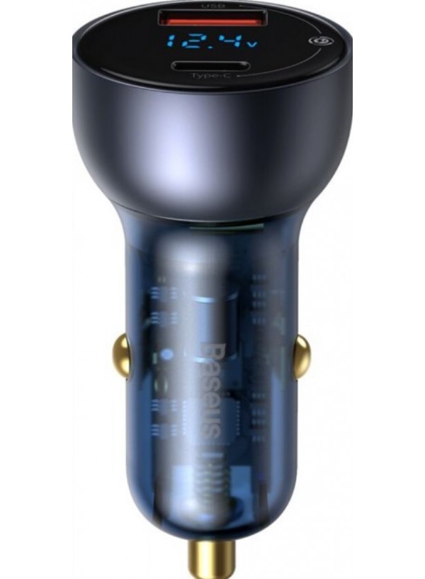
Зарядний пристрій від Baseus в ексклюзивному прозорому дизайні Particular Digital Display QC + PPS Dual Quick Charger Car Charger стане універсальним помічником в автомобілі і дозволить заряджати одночасно два мобільних пристрої. Модель з цифровим дисплеєм для контролю і парою сучасних роз'ємів USB актуальна для салону будь-якого легкового або вантажного авто. Прилад допоможе швидко і безпечно поповнити заряд в телефоні, що дозволить завжди не втрачати зв'язку із зовнішнім світом.

 Russian