
 Russian
Кабінет
Бездротовий контролер DualSense (PS5) DualSense (PS5)
Код товару: 2252-01
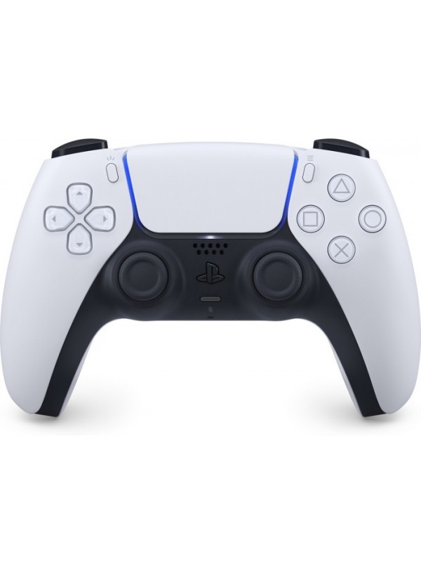


- 3499 грн.
- Наявність: В наявності
Швидка доставка
м. Подільськ
— Самовивіз з магазину, Привокзальна пл 2В
— Кур'єром по місту
У ЛЮБИЙ ЗАКУТОК УКРАЇНИ
— На відділення Нової Пошти
— Адресна доставка від Нової Пошти
14 днів на обмін\повернення
При зберіганні товарного вигляду згідно с дійсним законодавством.
Оплата
— Оплата при отриманні
— Готівкою кур'єру
— Безготівковий розрахунок
— Передплата
| Вага та габарити | |
| Комплектація | DualSense (PS5) |
| Зовнішній вигляд | |
| Колір | Білий |
| Додатково | |
| Обмін і повернення товару | Обмін і повернення товару здійснюється протягом 14 днів після покупки, відповідно до закону України"Про захист прав споживачів України" |
| Додатково | Характеристики та комплектація товару можуть бути змінені виробником без повідомлення. |
Опис
Опис та характеристики
.tab .content.description-content { padding-right: 0px !important; } .tab .content { padding: 0px !important; } .l-container { max-width: 1198px; background-color: #fff; position: relative; overflow: hidden; } .l-section { width: 100%; display: -webkit-box; display: -ms-flexbox; display: flex; background-color: #fff; position: relative; } @media screen and (max-width: 768px) { .l-section { max-height: none; height: auto; } } .l-color-background-1 { background: #FFFFFF; } .l-color-background-2 { background: #FFFFFF; } .l-color-background-3 { background: #EBEBEB; } .l-color-background-4 { background: #FFFFFF; } .l-color-background-5 { background: linear-gradient(90deg, #FFFFFF 0%, #EBEBEB 100%); } .l-color-background-6 { background: #FFFFFF; } .l-color-background-7 { background: #EBEBEB; } .l-color-background-8 { background-color: linear-gradient(180deg, #FFFFFF 0%, #EBEBEB 100%); } .l-color-background-9 { background-color: #F8F7FE; } .l-color-background-10 { background-color: #F8F7FE; } .logo-title-wrapper h2 { padding-left: 0!important; } .l-half { width: 50%; position: relative; } @media screen and (max-width: 768px) { .l-half { width: 100%; height: 50%; } } .logo-title-wrapper { display: -webkit-box; display: -ms-flexbox; display: flex; -webkit-box-align: center; -ms-flex-align: center; align-items: center; padding-top: 3%; padding-left: 8.35%; } .logo-title-wrapper2 { display: -webkit-box; display: -ms-flexbox; display: flex; -webkit-box-align: center; -ms-flex-align: center; /* align-items: center; */ padding-top: 3%; align-self: flex-start; margin-bottom: 4%; } @media screen and (max-width: 768px) { .logo-title-wrapper, .logo-title-wrapper2 { -webkit-box-pack: center; -ms-flex-pack: center; justify-content: center; padding-left: 0; align-self: center; } } .l-logo { padding-right: 15px; } @media screen and (max-width: 480px) { .logo-title-wrapper, .logo-title-wrapper2 { -webkit-box-orient: vertical; -webkit-box-direction: normal; -ms-flex-direction: column; flex-direction: column; } .l-logo { padding-right: 15px; padding-bottom: 7px; } } .l-main-title { font-size: 29px!important; font-weight: bold; padding: 0; margin: 0; -webkit-box-flex: 1; -ms-flex: 1; flex: 1; } @media screen and (max-width: 768px) { .l-main-title { text-align: center; padding-bottom: 2.61%; padding-top: 2.61%; -webkit-box-flex: 1; -ms-flex: 1; flex: 1; } .l-img-padding2 { padding-bottom: 9px; padding-top: 20px; } } @media screen and (min-width: 481px) and (max-width: 768px) { .l-logo { padding-right: 15px; } } @media screen and (max-width: 480px) { .l-main-title { -webkit-box-flex: 0; -ms-flex: 0; flex: 0; font-size: 28px!important; } .l-logo { padding-right: 0px; } .l-main-title-color { text-align: center; } } .l-main-title-color { color: #005DA9; ; } .l-description { -webkit-box-sizing: border-box; box-sizing: border-box; display: -webkit-box; display: -ms-flexbox; display: flex; -webkit-box-align: center; -ms-flex-align: center; align-items: center; -webkit-box-pack: center; -ms-flex-pack: center; justify-content: center; -webkit-box-orient: vertical; -webkit-box-direction: normal; -ms-flex-direction: column; flex-direction: column; padding: 0 8.35%; height: 100%; } .l-description2 { -webkit-box-sizing: border-box; box-sizing: border-box; display: -webkit-box; display: -ms-flexbox; display: flex; -webkit-box-align: center; -ms-flex-align: center; align-items: center; -webkit-box-pack: center; -ms-flex-pack: center; justify-content: flex-start; -webkit-box-orient: vertical; -webkit-box-direction: normal; -ms-flex-direction: column; flex-direction: column; padding: 0 8.35%; height: 100%; } @media screen and (max-width: 768px) { .l-description, .l-description2 { text-align: center; } } .l-description-colorw { color: #fff; } .l-description-colorb { color: #000; } .l-title-colorw { color: #fff; } .l-title-colorb { color: #000; } .l-title-colorc { color: #0072CE; } .l-paragraph-colorb { color: #000; } .l-paragraph-colorc { color: #494B4F; } .l-paragraph-colorw { color: #fff; } .pb { padding-bottom: 40px; } .pb2 { padding-bottom: 50px; } .pt { padding-top: 40px; } .pt2 { padding-top: 50px; } @media screen and (max-width: 768px) { .pt, .pt2 { padding-top: 0; } .pb, .pb2 { padding-bottom: 0; } } .l-title { font-size: 28px; padding: 0; margin: 0; margin-bottom: 4.01%; font-weight: normal; line-height: 38px; width: 100%; text-align: left; } @media screen and (max-width: 768px) { .l-title { margin-top: 30px; text-align: center; } } @media screen and (max-width: 480px) { .l-title { font-size: 24px; } } .l-title-color { color: #000; } .l-title-color2 { color: #fff; } .l-paragraph { font-size: 16px; line-height: 22px; padding: 0; margin: 0; } @media screen and (max-width: 768px) { .l-paragraph { margin-bottom: 30px; } } @media screen and (max-width: 480px) { .l-paragraph { font-size: 16px; } } .l-paragraph-color { color: #000; } .l-paragraph-color2 { color: #fff; } .l-img { max-width: 100%; -o-object-fit: cover; object-fit: cover; } .l-img-witdh { width: 33.2%; padding-right: 1%; } .l-img-witdh2 { width: 24.5%; padding-right: 1%; } .l-img-witdh3 { width: 49%; padding-right: 1%; } .l-img-witdh:last-child { padding-right: 0%; } .l-img-witdh2:last-child { padding-right: 0%; } .l-img-witdh3:last-child { padding-right: 0%; } @media screen and (max-width: 768px) { .l-img-witdh2 { width: 49.6%; padding-right: 1%; padding-bottom: 1%; } .l-img-witdh3 { width: 90%; padding-bottom:15px; padding-right: 0; } } @media screen and (max-width: 576px) { .l-img-witdh, .l-img-witdh2 { width: 90%; padding-bottom:15px; } .l-img-witdh:last-child, .l-img-witdh2:last-child { padding-bottom:0px; } } .l-img-wrapper { display: -webkit-box; display: -ms-flexbox; display: flex; -ms-flex-wrap: wrap; flex-wrap: wrap; justify-content: center; } .l-center { display: -webkit-box; display: -ms-flexbox; display: flex; -webkit-box-align: center; -ms-flex-align: center; align-items: center; -webkit-box-pack: center; -ms-flex-pack: center; justify-content: center; } @media screen and (max-width: 768px) { .l-center img { height: auto; } .l-paragraph-center, .l-description, .l-description2 { padding: 0 3%!important; } } .l-title-center { text-align: center; margin-top: 30px; margin-bottom: 2.01%; } .l-paragraph-center { text-align: center; padding: 0 8.35%; margin-bottom: 30px; } .l-flex { display: -webkit-box; display: -ms-flexbox; display: flex; -webkit-box-orient: vertical; -webkit-box-direction: normal; -ms-flex-direction: column; flex-direction: column; } .l-relative { position: relative; } @media screen and (max-width: 768px) { .l-section-reverse { -webkit-box-orient: vertical; -webkit-box-direction: reverse; -ms-flex-direction: column-reverse; flex-direction: column-reverse; } } @media screen and (max-width: 768px) { .l-column { display: -webkit-box; display: -ms-flexbox; display: flex; -webkit-box-orient: vertical; -webkit-box-direction: normal; -ms-flex-direction: column; flex-direction: column; } .m1 { max-width: 100%; } .m2 { max-width: 100%; } .m3 { max-width: 100%; } .m4 { max-width: 100%; } .m5 { max-width: 100%; } .m6 { max-width: 100%; } .m7 { max-width: 100%; } .m8 { max-width: 100%; } .m9 { max-width: 100%; } .m10 { max-width: 100%; } .product-cms__big-description { padding:0!important; } } @media (min-width: 800px) and (max-width: 940px) { .l-paragraph { font-size: 14px; line-height: 20px; } .l-title { font-size: 23px!important; margin-bottom: 2%; line-height: 26px; } .l-main-title { font-size: 23px!important; line-height: 26px!important; padding-bottom: 5px!important; } } @media (min-width: 769px) and (max-width: 799px) { .l-paragraph { font-size: 12px; line-height: 19px; } .l-title { font-size: 21px!important; margin-bottom: 2%; line-height: 26px; } .l-main-title { font-size: 23px!important; line-height: 26px!important; padding-bottom: 5px!important; } } .l-img-padding2 { padding-bottom:30px; padding-top:30px; } /* photo-format */ .{ max-width: 90%; margin: 5% 5%; border-radius: 3%; } .icon-container { display: flex; justify-content: space-around; flex-wrap: wrap; } .icon-divider { flex-basis: content; } .l-img-witdh3 { width: 24.5%; padding-bottom: 3%; } @media screen and (max-width: 768px) { .l-img-witdh3 { width: 24.5%; /* padding-right: 1%; */ padding-bottom: 3%; } } @media screen and (max-width: 576px) { .l-img-witdh3 { width: 48%; padding-bottom: 5%; } } .video-container { overflow: hidden; position: relative; width: 58%; border-radius: 20px; margin-top: 4%; margin-bottom: 3%; } .video-container::after { padding-top: 56.25%; display: block; content: ''; } .video-container iframe { position: absolute; top: 0; left: 0; width: 100%; height: 100%; } .video-container-side { overflow: hidden; position: relative; width: 87%; border-radius: 20px; } .video-container-side::after { padding-top: 56.25%; display: block; content: ''; } .video-container-side iframe { position: absolute; top: 0; left: 0; width: 100%; height: 100%; } @media screen and (max-width: 768px) { .video-container{ width: 92%; margin-top: 6%; margin-bottom: 13%; } .video-container-side{ width: 92%; margin-top: 6%; margin-bottom: 13%; } } .l-img-witdh3 { width: 24.5%; padding: 4% 0 4%; } @media screen and (max-width: 768px) { .l-img-witdh3 { width: 40%; padding: 2% 0 4%; } } @media screen and (max-width: 375px) { .l-img-witdh3 { width: 45%; } } .cut-img { max-width: 90%; margin: 5% 5%; border-radius: 24px; } /*для текста слева*/ .cut-img2 { /*max-width: 90%;*/ margin: 5% 0 5% 5%; border-radius: 24px 1px 1px 24px; } /*для текста справа*/ .cut-img3 { /*max-width: 90%;*/ margin: 5% 5% 5% 0; border-radius: 1px 24px 24px 1px; }
| Вага та габарити | |
| Комплектація | DualSense (PS5) |
| Зовнішній вигляд | |
| Колір | Білий |
| Додатково | |
| Обмін і повернення товару | Обмін і повернення товару здійснюється протягом 14 днів після покупки, відповідно до закону України"Про захист прав споживачів України" |
| Додатково | Характеристики та комплектація товару можуть бути змінені виробником без повідомлення. |
.