
 Russian
Кабінет
Areox intelligent fingerprint U-lock
Код товару: 1874-01
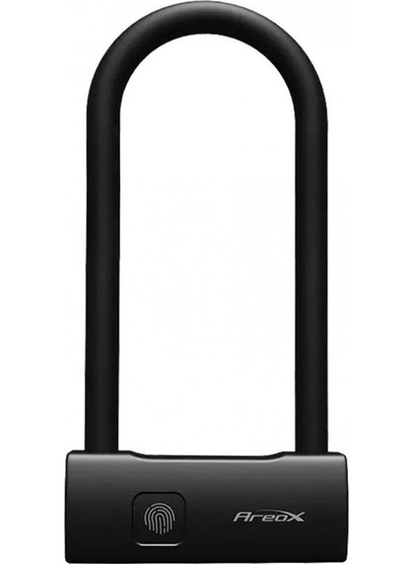


- 999 грн.
- Наявність: В наявності
Швидка доставка
м. Подільськ
— Самовивіз з магазину, Привокзальна пл 2В
— Кур'єром по місту
У ЛЮБИЙ ЗАКУТОК УКРАЇНИ
— На відділення Нової Пошти
— Адресна доставка від Нової Пошти
14 днів на обмін\повернення
При зберіганні товарного вигляду згідно с дійсним законодавством.
Оплата
— Оплата при отриманні
— Готівкою кур'єру
— Безготівковий розрахунок
— Передплата
Опис
Опис та характеристики
Areox_intelligent * { margin: 0; padding: 0 } .tab .content.description-content { padding-right: 0 !important } .tab .content { padding-left: 0 !important } .cont { height: auto !important } .prod_wrap { max-width: 1198px; margin: 0 auto; overflow: hidden; position: relative; background: #fff; font: 11px/1.35 Arial, Helvetica, sans-serif } .general_title { text-align: left; font-size: 30px !important; line-height: 40px !important; color: #069599 !important; font-weight: 700 !important } .general_title span { color: #0ab2b3 !important; padding: 5px; font-weight: 700 !important; border-radius: 10px; padding: 5px 15px } .land_pics, .pic_adptv_block, .text_adptv_block { width: 100%; position: relative } .pic_adptv_block { position: relative } .text_adptv_block { text-align: center; width: 70%; margin: 0 auto; position: relative } .text_adptv_block_inner { padding-bottom: 50px; padding-top: 50px } .wrap_for_full { position: relative } .flex_block { position: relative; padding-top: 50px; display: -webkit-flex; display: -moz-flex; display: -ms-flex; display: -o-flex; display: flex; justify-content: space-between; -ms-align-items: center; align-items: center; -webkit-flex-wrap: wrap; -moz-flex-wrap: wrap; -ms-flex-wrap: wrap; -o-flex-wrap: wrap; flex-wrap: wrap } .width50 { width: 50%; position: relative } .flex_block_big .width100 { width: 100%; position: relative; z-index: 1 } .flex_block_big .under_width100 { position: absolute; z-index: 2; -ms-align-self: center; align-self: center } .flex_pic { z-index: 4; position: relative; display: block; width: 80%; margin: 0 auto } .flex_text { z-index: 4; width: 100%; text-align: center } .flex_text { z-index: 4; text-align: left; -ms-align-items: center; align-items: center; width: 80%; margin: 0 auto; position: relative } .text_title { z-index: 4; text-align: left; font-size: 28px !important; line-height: 30px !important; padding-bottom: 30px; color: #000 !important; font-weight: 400 !important; padding-top: 50px; position: relative } .text_general { z-index: 4; text-align: left; color: #000 !important; font-size: 16px !important; line-height: 22px !important; padding-bottom: 50px; position: relative } .flex_block_big .text_title { color: #fff !important } .flex_block_big .text_general { color: #fff !important } .items_wrap { width: 100%; padding: 10px } .items_block { text-align: center; display: -webkit-flex; display: -moz-flex; display: -ms-flex; display: -o-flex; display: flex; justify-content: space-around; width: 99%; margin: 0 auto; -webkit-flex-wrap: wrap; -moz-flex-wrap: wrap; -ms-flex-wrap: wrap; -o-flex-wrap: wrap; flex-wrap: wrap } .item .general_text { font-size: 16px !important } .item .general_text { padding: 10px 0 } .item img { width: auto; display: inline-block !important } .indep_pic_right { position: absolute; z-index: 3; right: -70px; top: 50px } .indep_pic_left { position: absolute; z-index: 3; left: -100px; top: 450px } @media only screen and (max-width:768px) { .indep_pic_left, .indep_pic_right { display: none !important } .width50 { width: 100% } .flex_text { text-align: center } .text_adptv_block, .text_order { order: 1 } .text_adptv_block { width: 90% } .flex_block { -webkit-flex-direction: column-reverse; -moz-flex-direction: column-reverse; -ms-flex-direction: column-reverse; -o-flex-direction: column-reverse; flex-direction: column-reverse } .flex_block_big { background: #fff !important; padding-top: 0 } .flex_block_big .under_width100 { position: relative } .flex_block_big .width100 { transform: scale(2); right: 50% } .flex_block_big .under_width100 .flex_text h3 { width: 100%; background: #000 !important; mix-blend-mode: difference } .flex_block_big .under_width100 .flex_text p { width: 100%; background: #000 !important; mix-blend-mode: difference } .flex_block_big .under_width100 .flex_text { width: 100% } .spustit1 { top: 0 !important } } @media only screen and (max-width:500px) { .prod_wrap { overflow: hidden } .land_pics { width: 200% } .battery { width: 100% !important; right: 0 } }
.